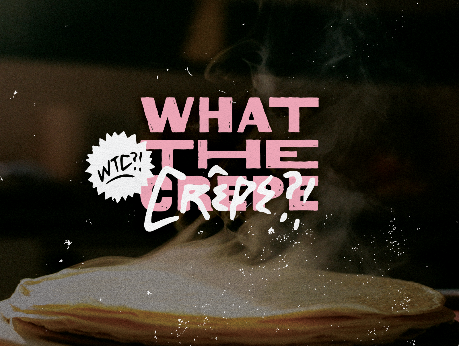
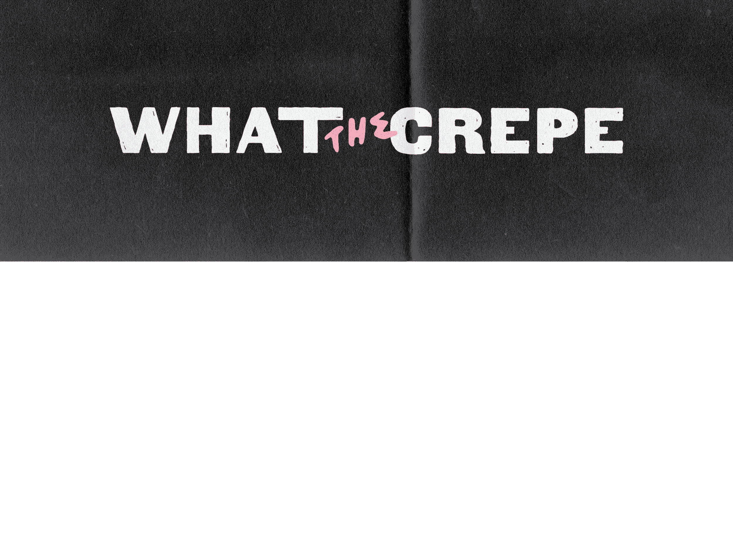
branding & packaging design for crepe brand in DUBAI
THE BRIEF
The main goal for WTC was to roll-out their brand in the way that it connected with their younger, city-based target demographic and showcased personality in an otherwise more traditional local market.
THE SOLUTION
To achieve this we developed a relatable, and as the name suggests, tongue-in-cheek approach that spoke to that narrative. Using elements derived from emojis and street art as well as lettering inspired by punk music culture, we were able to give the brand a punchy and satirical yet organic and approachable final identity.
THE DELIVERABLES
Strategy, Logo Design, Brand Identity, Illustration, Packaging Design.


LIKE SOMETHING YOU SEE?
Just hit the button below and fill out our super simple enquiry form to get started.
I can’t wait to hear about your new project!